The invisible building

Once upon a time, I got a masters degree in architecture, and then I went to work for a well-known and well-respected architect and urban designer, Lou Sauer, a Fellow of the American Institute of Architects. Sauer was teaching at the University of Pennsylvania at the time, and he spoke passionately about the need to teach architects good urban-design principles. In one conversation, he said he had assigned a project to his architecture students to design a building to be located in the central quadrangle of the Penn campus. It was a “trick” project because the right answer, according to Sauer, was not to put a building in that beautiful iconic space at all. Only one of his students got it right, putting the programmed spaces underground and leaving the quadrangle more or less as it is. “When you give a person a hammer, all problems look like nails,” he lamented (or something to that effect), “but sometimes they’re just not.” I’ve never forgotten this lesson, for it applies to so much in life, not just buildings.

However, after all these years, I’ve finally seen another solution to the problem of putting a building in an iconic open space that is arguable better to leave untouched. An uncompromisingly modern building in a beautiful classical environment best left unspoiled. For I have seen an invisible building.

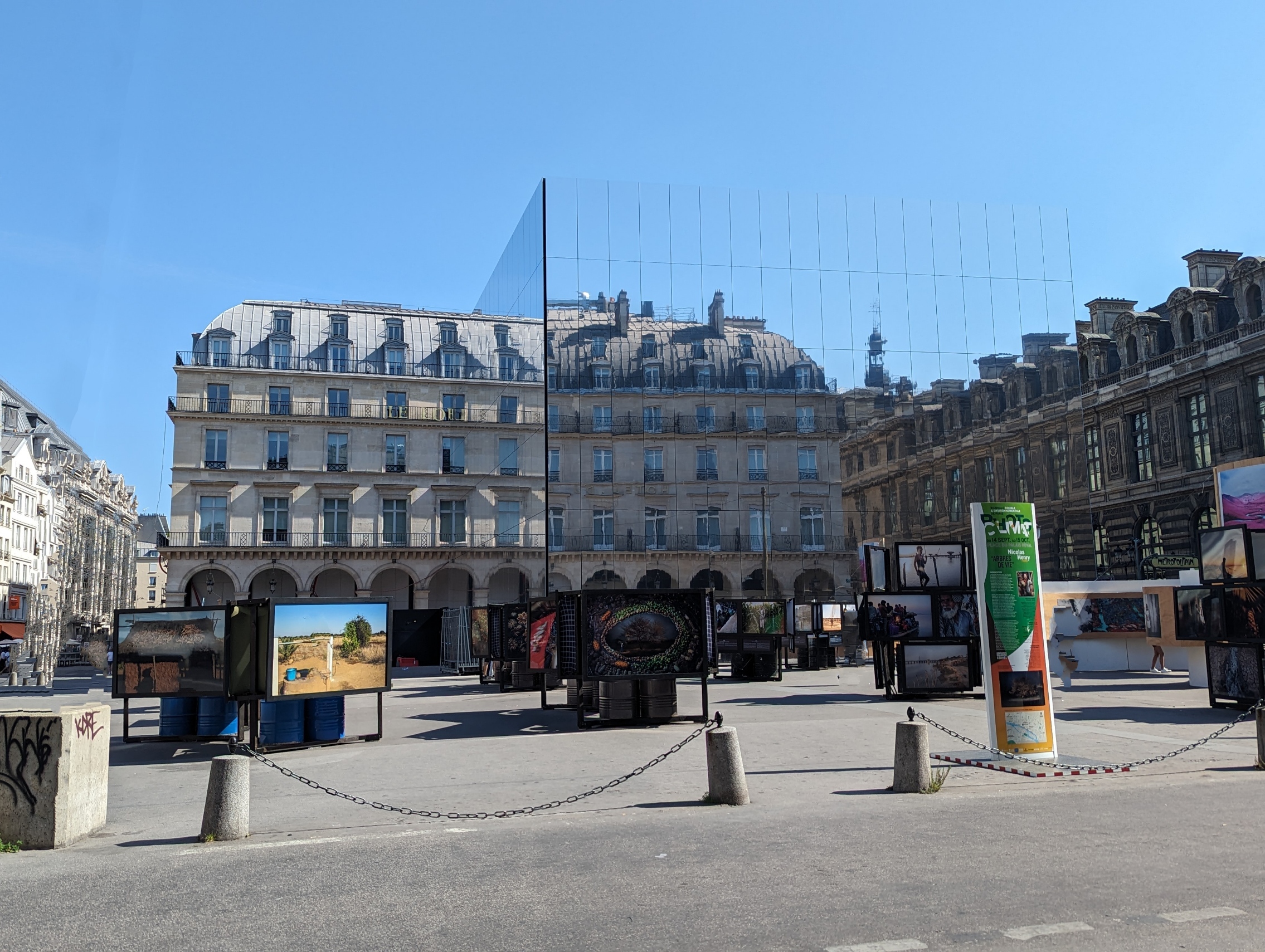
My mind is still reeling a bit from this. Was it a trick of the sky and the time of day, the weather and the angle of approach? The building happened to be along a route that my husband and I walked getting to and from our hotel. It can be seen a bit better from another angle and another time of day, but it’s still tricky.

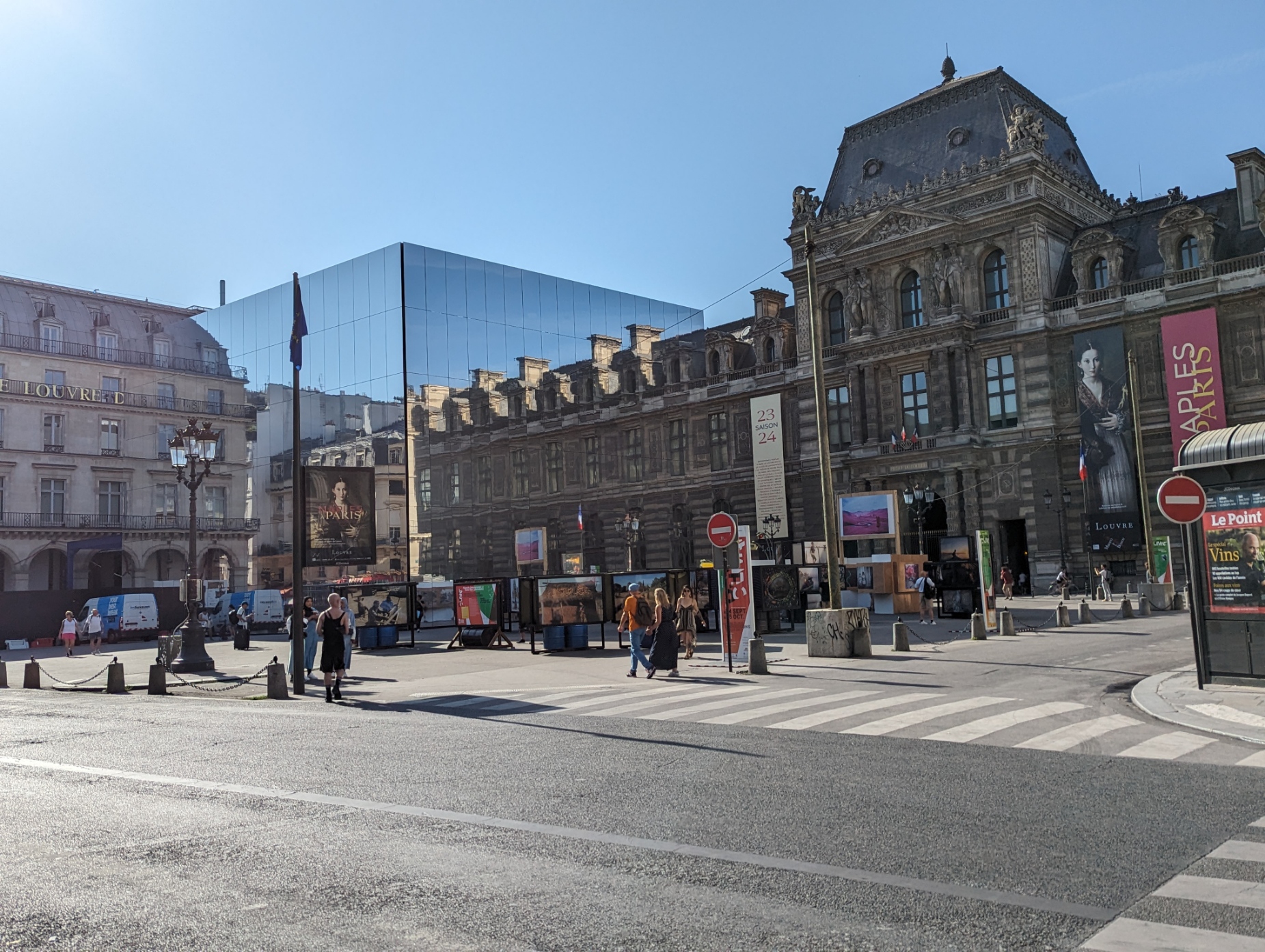
The building is the Cartier Foundation for Contemporary Art. Its architect, Jean Nouvel, has this to say about it:

Architecture where the game consists in blurring the tangible boundaries of the building and rendering superfluous the reading of a solid volume amid poetics of fuzziness and effervescence. When virtuality is attacked by reality, architecture must more than ever have the courage to take on the image of contradiction.

Well, I’m not entirely sure what all that architect-speak is about, but I do know that this building makes me laugh in delight. And there’s a lesson here, too. It’s always worth looking around the corner for an unexpected answer to a problem. You just might find it.

Melbourne — where architecture is fun

It’s confession time: I studied architecture, have a masters degree in it, in fact, from a university that is very serious about good design. And I believe that most modern architecture, particularly the high-rise vernacular of our center cities, is anything but good design.

But Melbourne is different.

Any city where the architecture makes you smile or even laugh, or shake your head in sheer disbelief… Well, that city has to be fundamentally delightful. And Melbourne is.

Now, come on, tell me, doesn’t this make you laugh out loud? Or at least maybe smile, just a little?

There’s something about the sheer modern exuberance of Melbourne that’s positively contagious.

(Yes, the reflective glass really is purple and blue and orange and green.)

And here’s another thing I like about Melbourne’s architecture: There is a certain respect for their architectural heritage. And that heritage is rich.

Often, the facades of old buildings are preserved even after the building is torn down to make room for a modern high-rise. Sometimes, in fact, the entire old building is preserved, and the high rise is cantilevered right out over it.

The juxtaposition is jarring, but also in a strange way, delightful. And Melbourne is fortunate to have preserved these fine old buildings.

Here and there, too, are classic, timeless, and perfectly lovely details.

My Son, Vietnam

My husband and I visited My Son before we truly understood the full antiquity and diversity of the many ethnic groups living in Vietnam. I don’t recommend this approach. But the obvious care with which the site has been and is being restored speaks to the importance of this ancient site and the respect the Vietnamese have for it.

The sign above, located at the drop-off point where visitors must leave their cars and buses, gives some indication of the extent of the site. This drop-off area is still some distance from the actual historical site. A special electric vehicle brings the visitors along a specially built road to the actual sanctuary. Isolated towers may be seen in the distance, Piranesian ruins surrounded by jungle.

At our destination, we learn that My Son was built by the Cham people during the thousand-year heyday of the Champa kingdom (or kingdoms; apparently, scholars disagree), from the fourth to about the fourteenth century A.D. The Champa kingdom in central Vietnam, where My Son is located, was defeated by the Vietnamese from the north in 1471, and the Cham people fled south. Many still live in southern Vietnam.

My Son was only ever a temple complex, at a short remove from the capital city. The Cham were, at that time, Hindu. (Most of the ones living in the south today are Muslim.) And the magnificent red-brick temples of My Son were Hindu temples and other religious buildings.

Located deep in the jungle, the temples of My Son were allowed to fall into ruin for centuries, until the late 1800s, when the French attempted some restoration. But war put an end to that, and when the North Vietnamese used the site as one of their bases, the Americans bombed it. Bomb craters are still visible. Several of the temples were severely damaged.

Perhaps this is fitting for a site largely devoted to Shiva, the god of destruction and war. But the site is beautiful, the temples magnificent even in ruin, and the complex an important monument in the history of civilization on Earth. As visitors and citizens of a diverse and wonderful world, my husband and I are grateful that My Son is now being carefully restored as a UNESCO World Heritage Site.

Before leaving, we were treated to a performance of Cham music and dance. Quite a treat!

In the Ginza

Tokyo subways are wonderrful. We took them everywhere. With few exceptions <cough, cough, Shibuya>, the signs are clear, the stations well marked, and even which exits lead where are clearly indicated. And it’s always surprising, when you leave the station at a new destination, what it’s going to look like. It could be the rather daunting so-called “pedestrian scramble” at Shibuya, for example.

sm20160910_180226 sm20160910_180232

Or it could be the sophisticaed shopping district of Ginza.

sm20160911_141341

sm20160911_141719

On the main street of Ginza, name brands and high-end developers can afford to build eye-catching buildings.

sm20160911_141437

sm20160911_141946

sm20160911_152212

In the narrower side streets, interesting shops, must make their presence known with banners and vertical signs.

sm20160911_142143

sm20160911_152348_001

inside one shop, we found this intriguing glass ceiling.

sm20160911_152522

sm20160911_152526_001

But what’s inside another store must wait for another post!

Vienna – Art Nouveau houses

As I mentioned in the previous post, Dan and I had come to Wienzeile in order to see a couple of noteworthy Art Nouveau style houses on Linke Wienzeile. And they were lovely–if a bit difficult to photograph in their entirety due to the pesky market buildings at our back.  😉 (Anyone who read the previous post will know at once that we loved the market on Wienzeile.)

The two Art Nouveau houses by architect Otto Wagner at numbers 38 and 40 Linke Wienzeile are indeed beautiful. And just as lovely is the way they meet each other as well as the next building–with a great deal of mutual respect, a value in architecture that has been much neglected by many buildings in modern times.

Starting at number 38, we see…

sm03 IMG_1782

From the corner, it’s almost “just another gilded building.” You’d hardly notice the Art Nouveau elements. But moving along, the style becomes more evident.

sm04 IMG_1783

This building is joined to the one at number 40 by balconies and by a nearly continuous wrought-iron railing.

sm05 IMG_1787 sm06 IMG_1789 sm07 IMG_1792

I love the pattern of tiles on the facade of the building at number 38! And just look at the railings and the decorations on the insides of the balconies!

Now, you might be thinking that it’s no great wonder that these two buildings, different as they are in many obvious particulars, are joined together so harmoniously. They are, after all, by the same architect.

But look at how respectfully the house at number 38 uses its ornamented balconies ans wrought-iron railings to join with the Baroque building next door.

sm08 IMG_1790 sm07a IMG_1786


Prague – Building details

Prague buildings are to architecture as Viennese pastry is to food.

sm IMG_1949

Beautiful, sweet, and delicious. Hard to carry on without other things in the diet, too. Maybe now I have to visit some ugly city just to cleanse my palate.

Okay, that was a joke.

I know I said I wasn’t going to do any more posts about the human figures on Prague’s buildings. But. I can’t not. They really are everywhere. However, in this post I will focus on ornamental features found near the tops of various buildings, including (where it happens) human figures. 

Some of this ornamentation is quite ornate.

sm IMG_1344

It can be sculpted or painted.

sm IMG_1308 sm IMG_1314

We saw a lovely sundial…

sm IMG_1367

…and elegant second- and third-floor bridges between buildings.

sm IMG_1572

This crowded boat looks like it might have some allegorical significance–but what?

sm IMG_1631cr

Best of all, these rich buildings seem content to live together side by side. It’s like having all the helpings of dessert you want and never getting sick!

sm IMG_1342


Singapore – Lasalle College of the Arts

Let’s start the section on Singapore with a puzzle, shall we?

Our Asian trip started in Singapore, where Dan was working and I spent two days on my own, mostly walking. I stumbled upon this striking building without the least clue what it was or who had designed it.

Click to Mix and Solve

I’m normally not a partisan of those ultra-modern buildings with the look of twisted bombing debris, but this place managed to make the style quite appealing.

The Lasalle Web site describes it this way:

Six organically shaped buildings, seven storeys high, feature inroads and alleyways running between them – much like lava flowing through a valley and canyons created by natural geological processes. This can be likened to the creative forces pouring from the students and teachers within.

I hope you enjoy the puzzle.

Views of Falling Water

At last we come to the guest house. This is all in one structure with the servants’ quarters, a three-car carport, and the, well… I guess it was a sort of living-room for the servants. The servant/car side of the structure now houses offices for the Western Pennsylvania Conservancy. The guest house, though adjoined, functions independently.

The covered walkway to the guest house takes off from a vestibule on the second floor of the main house. Here’s the beginning of the walkway (seen, I think, from the corner of the master bedroom deck on the second floor).

Here’s the best view of it, seen from the deck off Edgar Sr.’s room. This may be the only place from which the walkway and guest house structure are visible from the main house.

The walkway itself is an interesting structure. Its roof of reinforced concrete is cantilevered from only a few supporting posts, supported both by the depth of the posts’ footings (I forget whether our guide said 30 or 40 feet), by the compression on the interior of the curve, and by the folding of the canopy, which was all poured as one single structure. Just in case you were beginning to think you’d seen it all, when it comes to cantilevers!

Just as the guest house was barely visible from the main house, so the main house is barely visible from the guest house above. Where it can be seen at all, the visitor sees only the roof, which the architect has thoughtfully planted in ivy so that it doesn’t dominate the view. (I’m sure he wasn’t thinking of energy conservation at the time–but there you have it: a green roof!)

Many of the themes of the main house are carried into the guest house. These include a covered, but open, walkway to the entrance…

…nearly invisible glass corners…

…and a cantilevered structure covering part of the terrace.

That’s wisteria growing up there. It must be wonderful in the spring!

The terrace also adjoins a lovely, and private, spring-fed pool.

I ‘d like to thank everyone who has shared this tour with me through these pictures and blog posts. It’s been a privilege and a pleasure!

Views of Falling Water

Upstairs to the bedrooms!

We now live in an age of luxurious bedrooms and sumptuous baths. To our standards, the rooms upstairs at Falling Water are small and almost spartan. But then, as Frank Lloyd Wright must have intended, who would want to spend much time in the bedrooms anyway, with such magnificent living spaces? In the bedrooms at Falling Water, the visitor is reminded that bedrooms, after all, are for sleeping. With the eyes closed.

What more is needed, really, than a bed, a nearby shelf or nightstand, and some closet space? Oh… well… and a desk with shelves, a private deck, and of course a fireplace.

Maybe not so spartan after all. The bedrooms at Falling Water, though small, are comfortable and pleasant. As in the rest of the house, the details delight.

Here is the desk in the guest bedroom. The blinds were added later, perhaps because the windows overlook the master bedroom deck. The desk lamp is an original Frank Lloyd Wright piece, as are the night lamps by the beds.

Frank Lloyd Wright preferred methods other than blinds where he thought privacy would be necessary. Here is the sink of the master bathroom, which overlooks the master terrace. The planters are built into the fenestration.

The desk in the master bedroom has a genuine Tiffany lamp, as well as one of those wonderful windows where the glass wraps mullionlessly around the corner.

Here’s a view of that corner window as seen from the next deck over.

Yes, those are really fig trees. With real figs on them. And they’re going to ripen this year, too–or so we were told.

Here’s a nifty corner window detail found in both Edgar Sr.’s room and Edgar jr.’s above it. Each of these window pairs opens outward, leaving the corner entirely and breathtakingly open. Screens on the inside (opening inward) were added later; these unfortunately add to the heavy appearance of the windows when they are closed, but on a summer evening a person sensitive to mosquitoes can see why they were needed.

Let’s take a closer look at that desk detail (the same in both men’s rooms). It has been ever-so-cunningly designed so that the full-length window next to the desk can be opened (inwards) unhindered. Need more desk space? Er… no. You don’t.

This could be a small essay on the importance of the fenestration in the design of Falling Water. And no such essay would be complete without a closer look at the joining of glass and rock–as delicately and invisibly as possible.

Finally, each of the bedrooms has a deck/terrace (except the guest room). At least in some cases, the architect specified plantings for the terraces. The herb garden still grows outside Edgar jr.’s window.