The invisible building

Once upon a time, I got a masters degree in architecture, and then I went to work for a well-known and well-respected architect and urban designer, Lou Sauer, a Fellow of the American Institute of Architects. Sauer was teaching at the University of Pennsylvania at the time, and he spoke passionately about the need to teach architects good urban-design principles. In one conversation, he said he had assigned a project to his architecture students to design a building to be located in the central quadrangle of the Penn campus. It was a “trick” project because the right answer, according to Sauer, was not to put a building in that beautiful iconic space at all. Only one of his students got it right, putting the programmed spaces underground and leaving the quadrangle more or less as it is. “When you give a person a hammer, all problems look like nails,” he lamented (or something to that effect), “but sometimes they’re just not.” I’ve never forgotten this lesson, for it applies to so much in life, not just buildings.

However, after all these years, I’ve finally seen another solution to the problem of putting a building in an iconic open space that is arguable better to leave untouched. An uncompromisingly modern building in a beautiful classical environment best left unspoiled. For I have seen an invisible building.
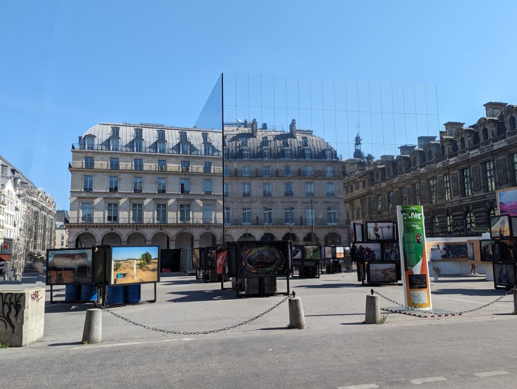
My mind is still reeling a bit from this. Was it a trick of the sky and the time of day, the weather and the angle of approach? The building happened to be along a route that my husband and I walked getting to and from our hotel. It can be seen a bit better from another angle and another time of day, but it’s still tricky.
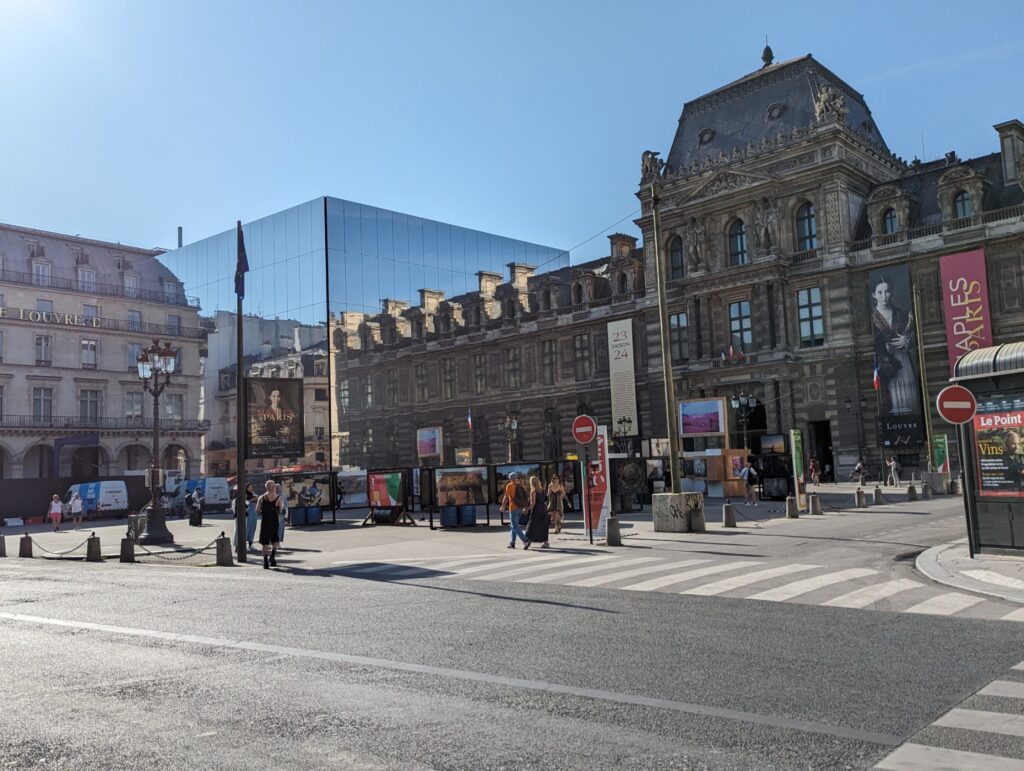
The building is the Cartier Foundation for Contemporary Art. Its architect, Jean Nouvel, has this to say about it:

Architecture where the game consists in blurring the tangible boundaries of the building and rendering superfluous the reading of a solid volume amid poetics of fuzziness and effervescence. When virtuality is attacked by reality, architecture must more than ever have the courage to take on the image of contradiction.

Well, I’m not entirely sure what all that architect-speak is about, but I do know that this building makes me laugh in delight. And there’s a lesson here, too. It’s always worth looking around the corner for an unexpected answer to a problem. You just might find it.

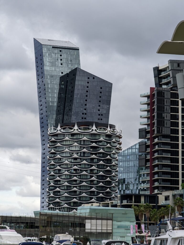
Melbourne — where architecture is fun

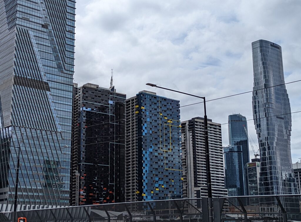
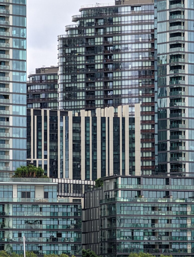
It’s confession time: I studied architecture, have a masters degree in it, in fact, from a university that is very serious about good design. And I believe that most modern architecture, particularly the high-rise vernacular of our center cities, is anything but good design.

But Melbourne is different.

Any city where the architecture makes you smile or even laugh, or shake your head in sheer disbelief… Well, that city has to be fundamentally delightful. And Melbourne is.

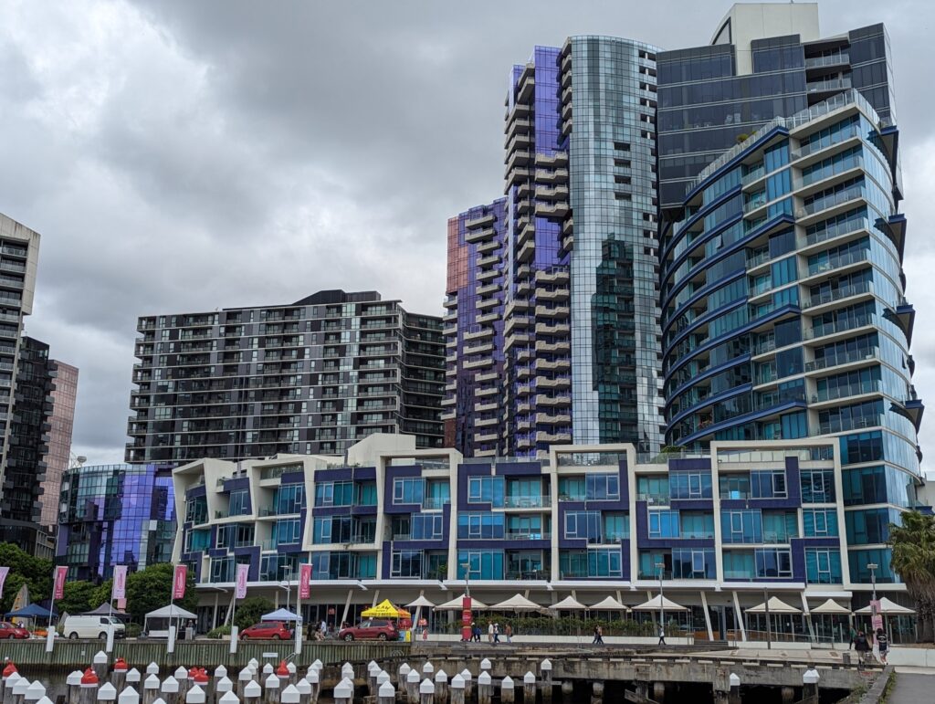
Now, come on, tell me, doesn’t this make you laugh out loud? Or at least maybe smile, just a little?

There’s something about the sheer modern exuberance of Melbourne that’s positively contagious.

(Yes, the reflective glass really is purple and blue and orange and green.)

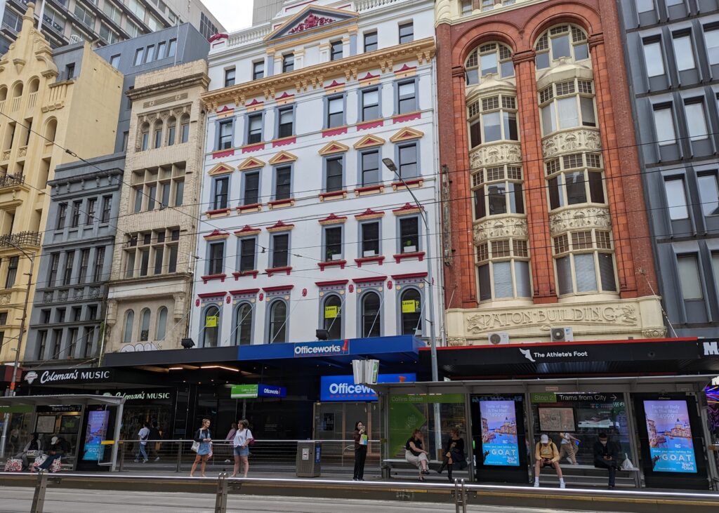
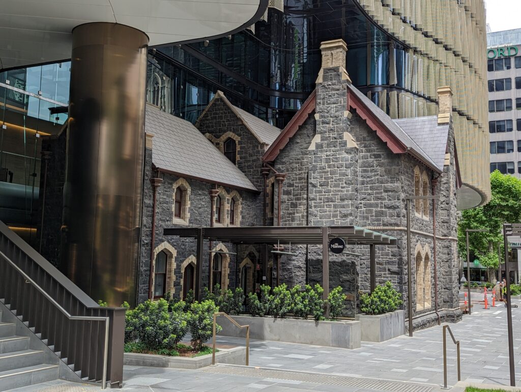
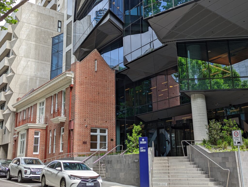
And here’s another thing I like about Melbourne’s architecture: There is a certain respect for their architectural heritage. And that heritage is rich.

Often, the facades of old buildings are preserved even after the building is torn down to make room for a modern high-rise. Sometimes, in fact, the entire old building is preserved, and the high rise is cantilevered right out over it.

The juxtaposition is jarring, but also in a strange way, delightful. And Melbourne is fortunate to have preserved these fine old buildings.

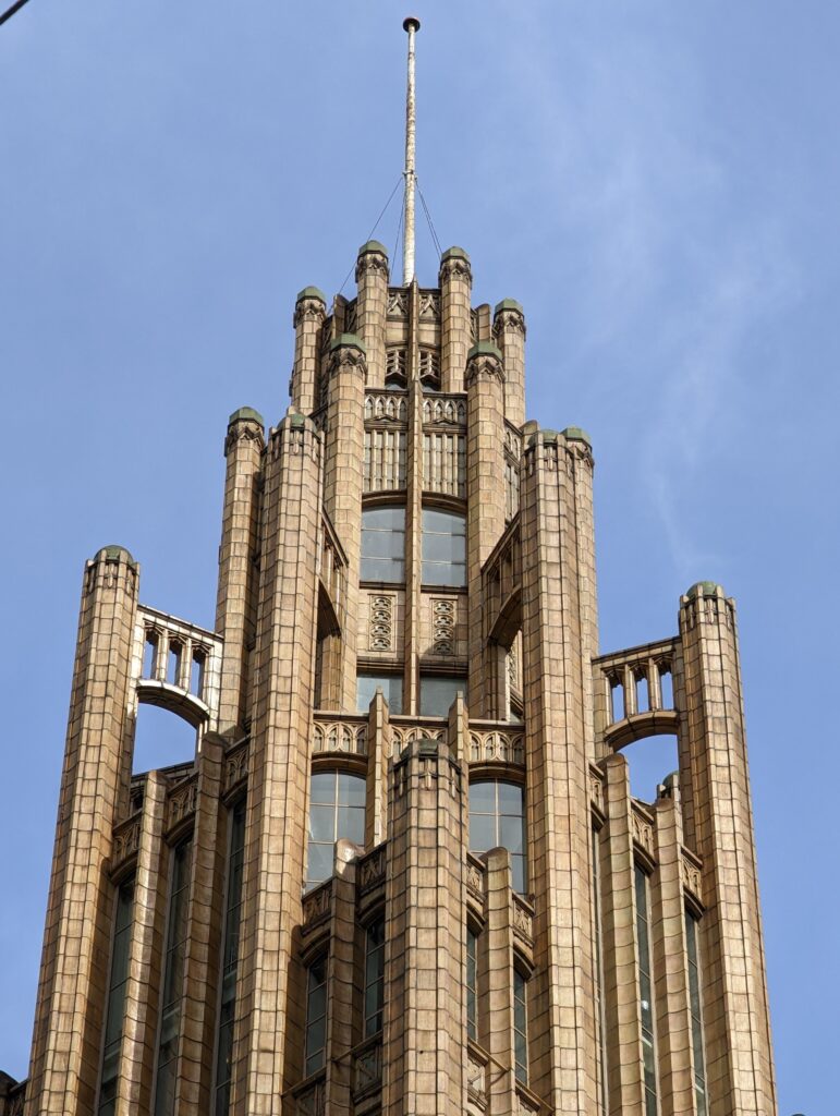
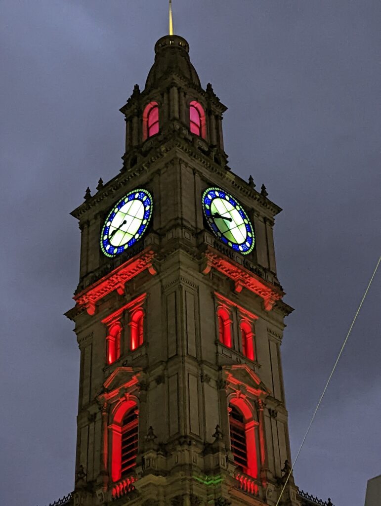
Here and there, too, are classic, timeless, and perfectly lovely details.

The streets of Asakusa

As a “shitamachi” (or low city) district of Tokyo, Asakusa has numerous charming pedestrian streets. For example, this is the street leading to the Sensoji shrine. It is lined with shops selling wares to tourists and to devotees.

sm20160912_093926

The entry to this street is emphasized by a fine gate.

sm20160912_094036

sm20160926_092742

There are streets with a covered arcades — interesting both by day and by night.

sm20160912_093805

sm20160925_194901

And, of course, there are just plain pleasant pedestrian streets!

sm20160926_094230

Lining the streets, whether pedestrian or not, are, of course, buildings. Some of these buildings are heart-meltingly attractive.

sm20160912_100731

Others, not so much–though these, too, sometimes have a certain charm.

sm20160926_094926

One feature of even the most ordinary buildings is a certain tendency to decoration–wonderful, very Japanese decoration.

sm20160926_092848

A dragon!

12sm20160926_093531

Samurai!

13sm20160926_093531cr1   14sm20160926_093531cr2

Finally, we found one especially fortuitous combination of all these things–pedestrian street, building, and decoration.

sm20160926_092321

sm20160926_092335

sm20160926_092356


In the Ginza

Tokyo subways are wonderrful. We took them everywhere. With few exceptions <cough, cough, Shibuya>, the signs are clear, the stations well marked, and even which exits lead where are clearly indicated. And it’s always surprising, when you leave the station at a new destination, what it’s going to look like. It could be the rather daunting so-called “pedestrian scramble” at Shibuya, for example.

sm20160910_180226 sm20160910_180232

Or it could be the sophisticaed shopping district of Ginza.

sm20160911_141341

sm20160911_141719

On the main street of Ginza, name brands and high-end developers can afford to build eye-catching buildings.

sm20160911_141437

sm20160911_141946

sm20160911_152212

In the narrower side streets, interesting shops, must make their presence known with banners and vertical signs.

sm20160911_142143

sm20160911_152348_001

inside one shop, we found this intriguing glass ceiling.

sm20160911_152522

sm20160911_152526_001

But what’s inside another store must wait for another post!

Prague – streetscapes

I feel a need to get out of the details for a while. So let’s look at these buildings in context–and in the city, that context is the street.

Come take a walk with us…

sm IMG_1350

sm IMG_1353

sm IMG_1520

sm IMG_1563

sm IMG_1591

sm IMG_1580

And finally, a street in the local neighborhood of our hotel, the excellent Louren Hotel, not in the tourist area but in District 3, a neighborhood just a couple of metro stops away from the city center.

sm IMG_1558